How to read the PAP usage chart
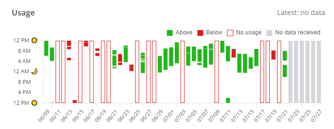
The vertical axis displays hours from noon to noon.
This chart shows a patient's daily PAP usage since their start of therapy. The red outline indicates no usage, and the red boxes indicate the patient did not meet the CMS four-hour threshold. The green boxes indicate the patient surpassed the four-hour usage threshold that patients must reach to be compliant based on the CMS definition of compliance. The gray boxes indicate that ComplianceCoach hasn't received data from the patient's device.